Brand Identity & Guidelines:
Case Study for Katha
Katha is an Australian photography personal brand with an objective to achieve global recognition. We crafted a sophisticated, world-class identity that authentically speaks to the worldwide photography community, blending linguistic tradition with modern artistic vision.
Scope of Work
Logo Conceptualisation & Design
Target Audience
The global photography community, including fellow artists, curators, high-end commercial and personal clients, and industry peers who value precision and authentic visual storytelling.
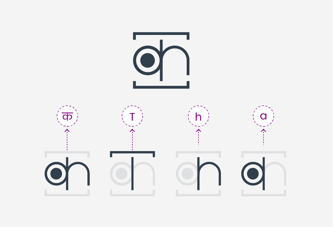
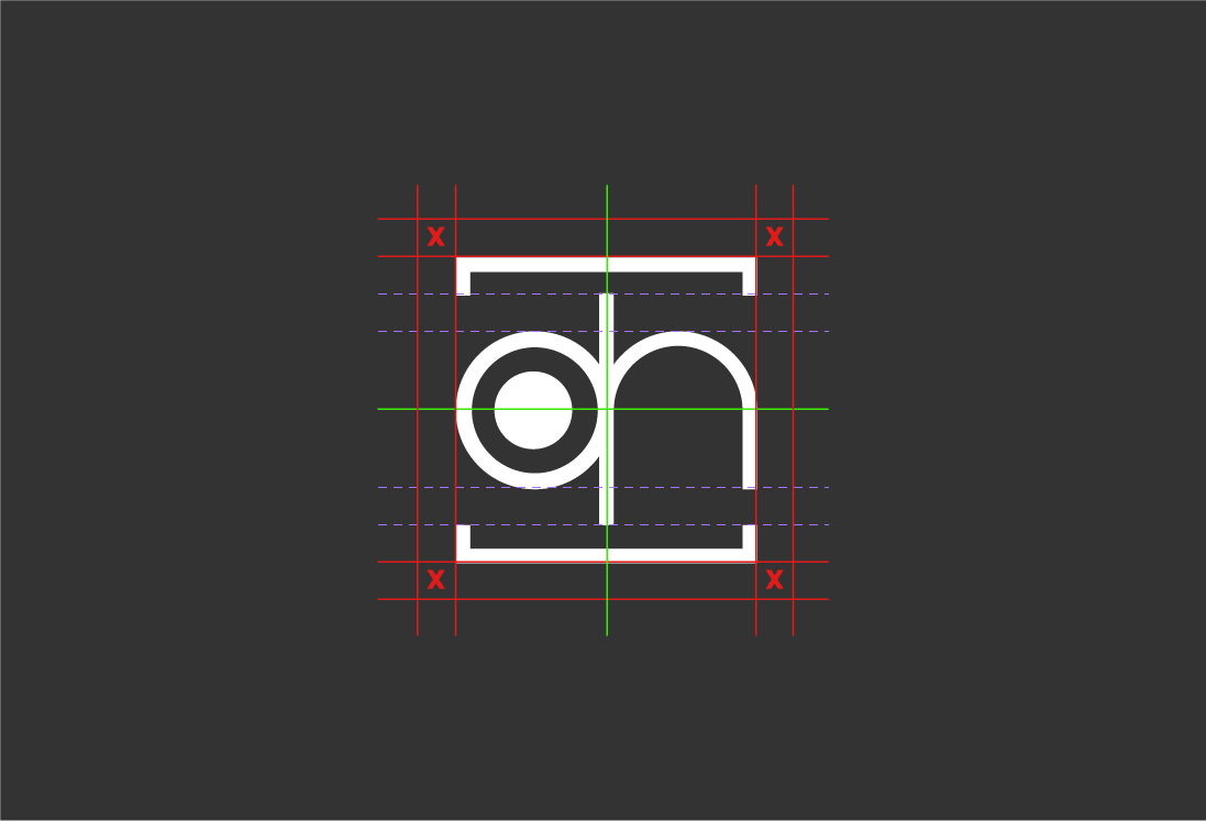
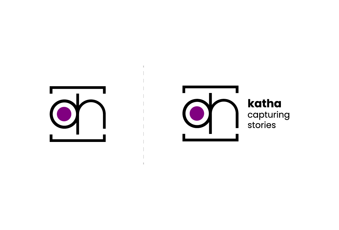
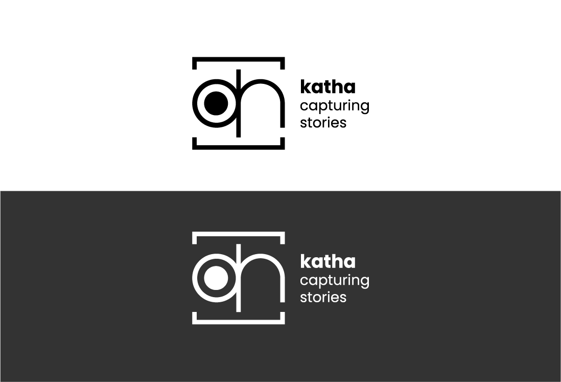
Logo & Core Concept
The logo needed to be a captivating blend of Hindi and English typography, camera lenses, and storytelling elements. The design is a minimalist symbol centred around the Hindi letter ‘क’. The entire mark is enclosed in a frame to symbolize a window or a photo frame, capturing the essence of storytelling and encompassing the letters ‘t,’ ‘h,’ and ‘a’.